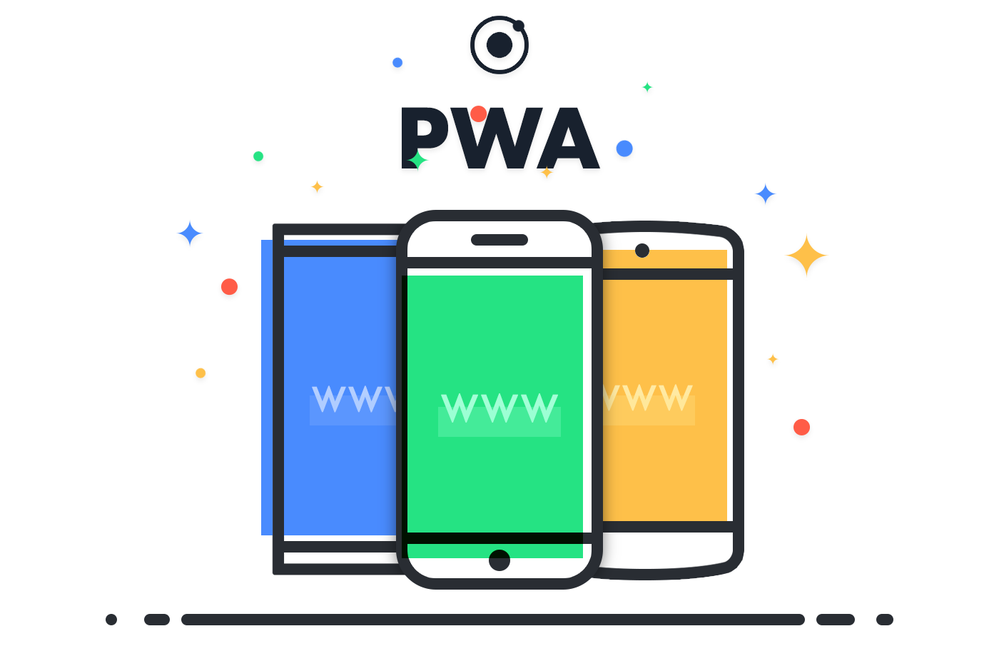
You have no doubt heard of Progressive Web Apps by now, PWA for short, haven’t you? No? That’s okay. The thing is still pretty new.
Although the concept is not entirely unique, recent advances in web standards & technologies have now made it possible to create mobile-first web apps that work equally well on desktops web apps that look good & consistent on different devices and that can “progressively” use additional underlying features in a device. Still don’t get what’s new?
Google presented the concept in its I/O developers’ conference earlier this year. As per Google:
A Progressive Web App uses modern web capabilities to deliver an app-like user experience.
Do check out Google’s developer website for a more elaborate introduction to PWA, although I found Smashing Magazine’s description of the same to me much more clearer.
I had been hearing about the hype since a few months but didn’t care much to explore it in detail. Up until Ionic, my favorite mobile app SDK, made their PWA support official.
I think it’s a smart move by Ionic to include PWA support. Until now, Ionic apps were too mobile-ish to be used as web apps. PWA support is an important update to an already great mobile SDK, and I hope this changes many things for the good.
Today, creating a new app essentially means (a) creating a solid backend API (b) creating client apps for various popular platforms (Android, iOS, etc.), and (c) optionally, creating a complementary web app for the desktop. PWA could be a game changer as it takes care of both (b) and (c) in a single development cycle.
While browsing the Google developer website, I stumbled across a very interesting case study for PWA.
Flipkart, India’s largest e-commerce site, decided to combine their web presence and native app into a Progressive Web Application that has resulted in a 70% increase in conversions.
In 2015, Flipkart, India’s largest e-commerce site, adopted an app-only strategy and temporarily shut down their mobile website. The company found it harder and harder to provide a user experience that was as fast and engaging as that of their mobile app. But then, Flipkart decided to rethink their development approach. They were drawn back to the mobile web by the introduction of features that made the mobile web run instantly, work offline, and re-engage users.
Yep, going app-only was a really stupid move by Flipkart. Thank God sense prevailed.
I am going to try out Polymer, a JavaScript library, from Google, for building progressive web apps. I think I’m going to make my next web app using Polymer rather than Bootstrap.